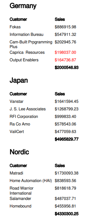
Creating highly formatted tables
You can create highly formatted tables in your PixelPerfect report template. The PixelPerfect designer allows for extensive control and customization during table creation. Create highly formatted tables by inserting levels, labels, and other content individually. Creating these tables involves the use of a DetailReport band, and associated GroupHeader and GroupFooter bands. You need to use levels to achieve the desired output.

The representation of data-bound objects in a tabular format is achieved by the action of connecting a level data binding to a DetailReport band.
When you create a highly formatted table, you can optionally nest it within other levels, and add calculated totals, conditional formats, and calculated columns.
Highly formatted PixelPerfect table
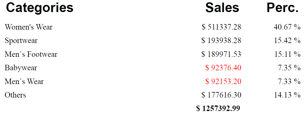
Workflow
At a high level, the recommended workflow is the following. For a full example, see Example - highly formatted table with a level.
Step 1: Create a data binding
Add a data binding to define the information you want to present in the table. In this case, you need to add a level corresponding to a chart in the Qlik Sense app. This is completed in the Field List menu.
Step 2: Create the banded structure
To create a highly formatted table, you need to create a series of bands that have specific data bindings. The bands need to be organized in a hierarchical structure as follows:
-
First, create a DetailReport band.
-
Add a GroupHeader band within the DetailReport band. It will automatically be added at the top of the band.
-
Add a GroupFooter band within the DetailReport band. It will automatically be added at the bottom of the band.
Step 3: Bind the structure to the data source
-
Use the Properties menu to add a Data Member for the DetailReport band you created in step 1.
For more information, see Data binding.
-
Add the individual fields from the level data binding. Do this by dragging and dropping them from the Field List as labels onto the Detail band that is located between the GroupHeader and GroupFooter.
Step 4: Add the table headers
Add table headers within the GroupHeader band by dragging label objects from the toolbox. Define the text in the labels with your custom fixed text.
Step 5 (optional): Add calculated totals for a column
If desired, you can add calculated totals into the GroupFooter.
-
Add a label for the field you want to aggregate onto the GroupFooter band.
-
Use the Properties menu to configure the label as a grouped aggregation. This is done under Text > Summary. Select Group in the Running drop down menu.
-
Define a formula for the label that incorporates a PixelPerfect summary function. You likely need to use sumSum().
Other enhancements: Levels, conditional formatting, and calculated columns
If needed, you can apply conditional formatting to elements in your PixelPerfect table. If you need to add columns with calculations that are not defined in the Qlik Sense app, you can use the PixelPerfect tools to define new calculations and add them to your table.
You can also nest your highly formatted table within one or more data-bound DetailReport bands to create a series of tables cycled along, for example, the values in a dimension
Example - highly formatted table with a level
Refer to the example app sources here: Example materials - In-app reporting. Upload the app and data files into a space, and then reload the app. You are ready to complete the example.
In this example, we create a highly formatted table that is nested within a Region level. You can also create a simpler report without nesting the table inside the Region level.
Create data bindings
We will first create the data binding for the level on which the table iteration is cycled, then we will create the data binding for the table itself.
Do the following:
-
Create a new PixelPerfect template.
-
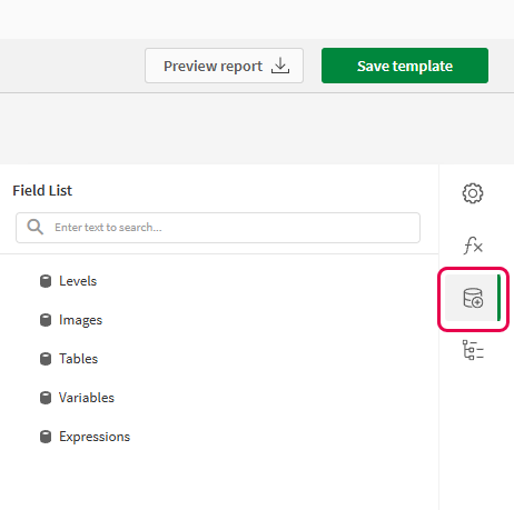
Open the
Field List menu available from the right-side panel in the designer.
Field List menu in the PixelPerfect designer
-
Hover your cursor over Levels, and then click
.
-
Expand Fields. Click
next to Region. The data binding is created.
-
You are brought back to the main menu in the
Field List. Hover your cursor over Levels again, and then click
.
-
Expand the Dashboard sheet. Next to Top 5 Customers, click
.
The data binding is created.
Create the banded structure
In this case, we use the same procedure as the general workflow, but add an extra step at the beginning to define the band that will be used to loop the creation of multiple tables.
Do the following:
-
On the design surface, right-click anywhere within the Detail1 band and click Insert Band > DetailReport.
A new DetailReport band is inserted below Detail1.
-
Right-click the Detail2 band within the Detail Report band you just created. Click Insert Band > DetailReport.
A new Detail Report band is inserted and nested within the first Detail Report band you created.
-
Right-click the Detail3 band within the second Detail Report band you just created. Click Insert Band > GroupHeader.
The band is inserted above the Detail3 band.
-
Right-click the Detail3 band within the second Detail Report band you created earlier. Click Insert Band > GroupFooter.
The band is inserted below the Detail3 band.
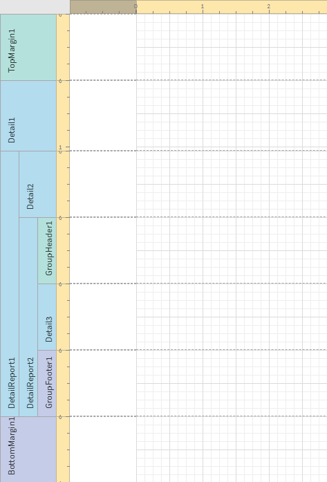
The structure should look like the following image.
Banded structure
Bind the content to the data sources
We start by binding the top-level DetailReport band to the level on which we want to multiply table creation and filtering. Then, we bind the data source for the table itself.
Do the following:
-
Select the outermost DetailReport band in the structure (DetailReport1).
-
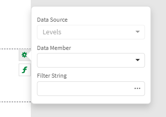
Click the gear icon at the edge of the design surface.
Clicking the gear icon
-
In the menu, select the Region level as the Data Member. This will create a separate table for each region in the app.
Tip noteAlternatively, clickat the far right of the designer. Add the Data Member under Detail Report Tasks.
-
Next, select the DetailReport2 band, and again click the gear icon at the edge of the design surface.
-
In the menu, select the Top 5 Customers level as the Data Member. This binds the table structure to the chart's source data.
-
Open the
Field List menu, and expand Levels.
-
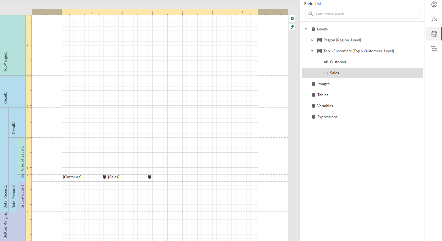
Drag each of the fields within the Top 5 Customers level onto the Detail3 band that is located between the GroupHeader and GroupFooter.
-
Arrange the field items on the band so they resemble two adjacent rows in a table.
Tip noteTo align objects precisely with the grid, resize them manually until they are as close to grid lines as possible. Then, right-click each object and select Layout > Size to Grid. You can also open the
Properties menu and adjust their size values numerically under Layout > Size.
For more information, see Arranging content in your PixelPerfect report template.
-
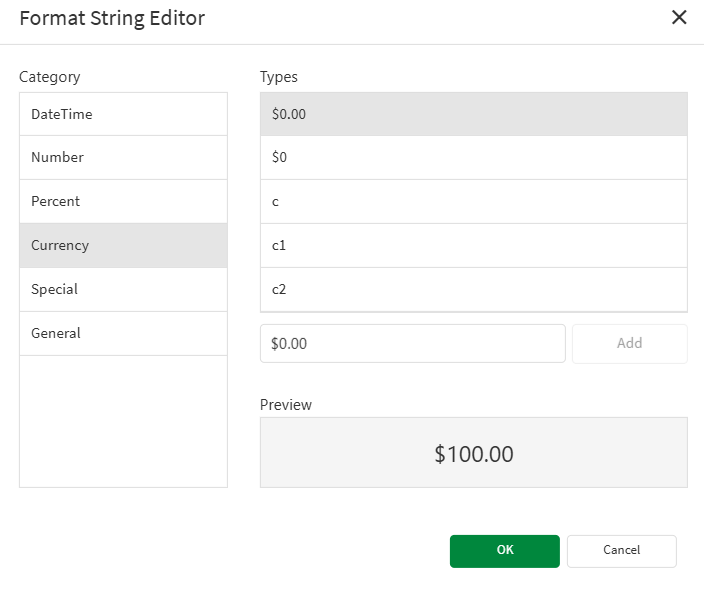
We need to format the Sales values as currency figures. Click the Sales label, and then click the gear icon that appears next to it.
-
In the popout menu, click the ellipsis (three dots) menu under Text Format String.
-
The Format String Editor dialog opens. Choose Currency, and adjust the decimal points. Click OK.
Configuring number formatting
-
Resize the Detail3 band, shrinking it so that it is only as small as the items in it.
Labels containing Customer and Sales fields added to the template
Add titles and column headers
Add titles and table headers within the GroupHeader band by dragging objects onto the design surface.
Do the following:
-
Let's add a title for the level controlling the creation of separate tables. Open the
Field List menu, and expand Levels.
-
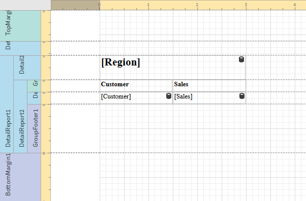
Expand the Region level, and drag the Region field within it onto the Detail2 band.
-
Customize font properties in the
Properties menu under Appearance > Font.
-
Resize the object as desired and then change the band size so that the objects take up the entire band height.
-
Next, let's add column headers. From the toolbox on the left side of the designer, drag two
Label objects (one for each column) onto the GroupHeader1 band.
-
Arrange the labels at the top of the GroupHeader1 band so that they are the same length as the table row labels.
-
Double-click each label and insert your own custom fixed text. In this case, you can use the field names.
-
Customize font as desired. For example, you might want columns headers to stand out, so you could make them bold.
-
Change the band size so that the objects take up the entire band height.
-
For the purposes of this example, reduce the sizes of the TopMargin1 and Detail1 bands.
Report template after adding table titles and headers
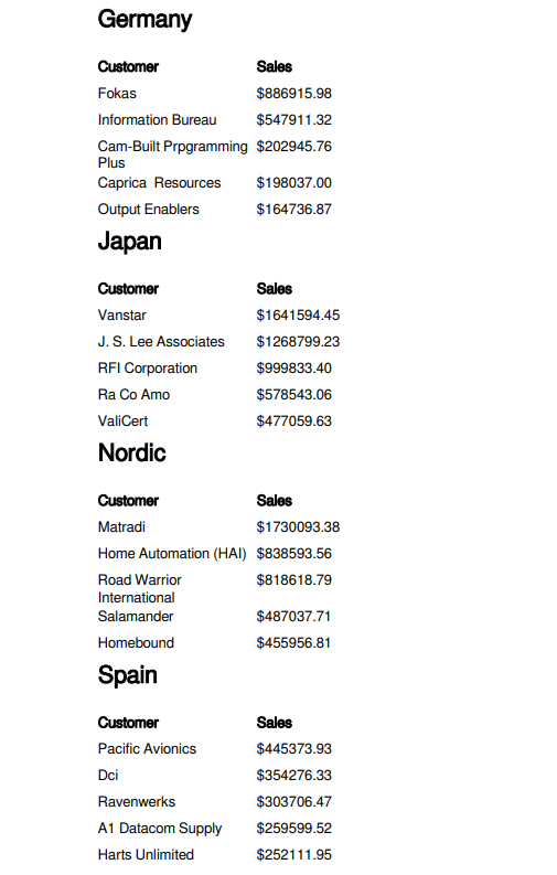
Click Save template, and then click Preview report. Download the report and open it to see how it looks so far.
First report preview for the example
Add calculated totals for a column
You can add calculated sales totals into the GroupFooter.
Do the following:
-
Open the
Field List menu, and expand Levels.
-
Expand the Top 5 Customers level, and drag the Sales field within it onto the GroupFooter1 band.
-
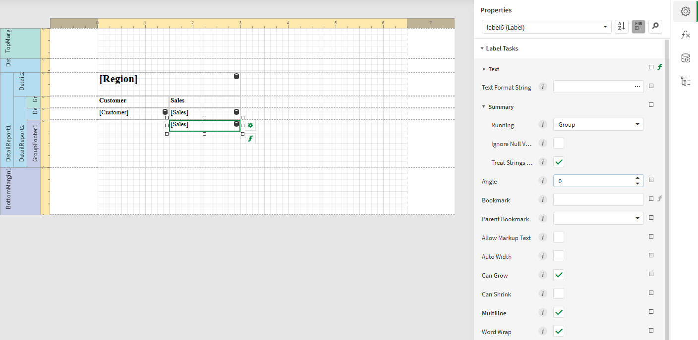
To set the total to be calculated for a group, open the
Properties menu for the label and expand Text > Summary. Select Group in the Running drop down menu.
Configuring group calculation for the totals row
-
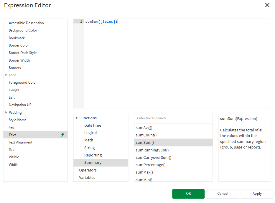
Click the bold f icon on the bottom right corner of the label to open the Expression Editor.
-
In the Expression Editor, expand the Functions node, select Summary, and double-click on sumSum(). The function is placed into the formula space. Be sure to include the field name between the parentheses. Click OK.
Using a summary function in the Expression Editor
-
Resize and reposition the label to be consistent with the other elements, and set its Text Format String and font as desired.
-
Reduce the size of the GroupFooter1 band. You might want to leave a bit more extra space on the bottom of the band to add spacing between each table in the level.
-
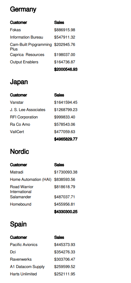
Save the template and run a preview.
Second preview for the example
Add conditional formatting
It is possible to create conditional formatting rules with the Expression Editor. For example, you could highlight sales values under $200,000 in red.
Do the following:
-
Select the Sales label (not the sumSum([Sales]) label).
-
Click the bold f icon on the bottom right corner of the label to open the Expression Editor.
-
In the left side panel, click Foreground Color, expand the Functions tree in the bottom menu, and select Logical.
-
Double-click Iif(, ,) to insert the function into the editor.
-
In the expression, before the first comma, enter [Sales].
-
You can select Operators in the bottom menu and double-click on the < symbol. Alternatively, enter the symbol by typing it into the editor. Then, type 200000.
-
Next, reposition your cursor to just after the first comma. Define how to format the text when the condition is true. Select Values in the bottom menu, and scroll down until you reach Red.
-
Double-click Red to insert it.
-
Repeat the process for the text after the second comma, but instead select a value of Black. This is shown when the condition is false.
-
You should have the following formula:
Iif( [Sales] < 200000, 'Red' , 'Black' ) -
Click OK.
-
Save the template and run a preview.
Third preview for the example
