Summarizing data with a Cross Tab
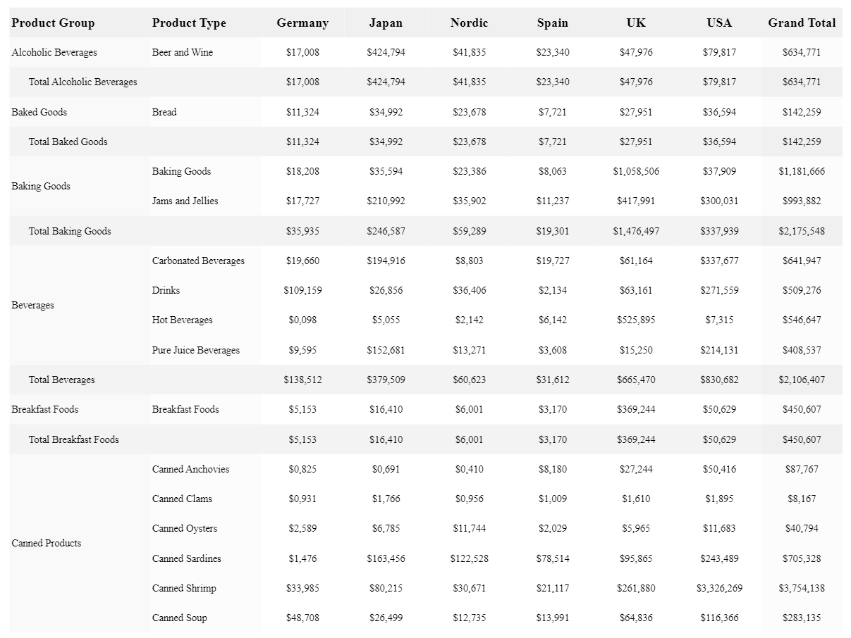
The Cross Tab presents multi-dimensional data in a highly customizable pivot table structure. Cross Tabs include auto-calculated totals for single dimensions, multiple dimensions, and across the entire table, making it a great way to summarize data. When you add a Cross Tab, you can configure specific parts of the table by selecting one of the cell objects individually.
Cross Tab in a PixelPerfect report

Requirements
The data you use for a Cross Tab has to be added as a table data binding. To create this type of data binding, use the Field List menu and add an item under Tables.
Creating a Cross Tab
Do the following:
-
Open the
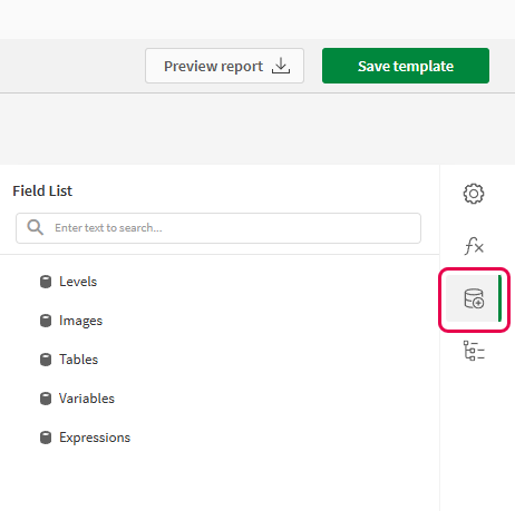
Field List menu available from the right-side panel in the designer.
-
Click the plus icon next to Tables.
-
From the available sheets, select the Qlik Sense chart you want to add as a table. Click the
icon next to it.
The data binding is added.
-
From the toolbox panel on the right side of the designer, drag a
Cross Tab onto the design surface.
-
Click the gear icon that appears next to the Cross Tab. In the pop-up menu, for Data Member, select the table data binding you created earlier.
-
Open the
Properties menu from the right side of the designer, and expand Data.
-
Expand Row Fields, and click the plus icon. For Field Name, select a field to use for the rows in the Cross Tab. This is similar to adding dimensions in a pivot table.
You can add more than one row field by clicking the plus icon again and repeating this process.
-
Expand Column Fields, and click the plus icon. For Field Name, select a field to use for the rows in the Cross Tab. This is similar to column field definitions in pivot tables.
You can add more than one column field by clicking the plus icon again and repeating this process.
-
Expand Data Fields, and click the plus icon. For Field Name, select a field to use for a variable metric you want to show (for example, total sales). This is similar to adding measures in a pivot table.
You can add more than one data field by clicking the plus icon again and repeating this process.
-
As needed, to achieve the desired presentation, configure the properties for the following report elements:
-
Each of the individual cells in the Cross Tab
-
Global settings for the entire report
-
The band in which you placed the Cross Tab
For further guidance, see Additional tips for configuring Cross Tabs.
-
Additional tips for configuring Cross Tabs
The above workflow shows you how to create a Cross Tab and connect it to data sources from the Qlik Sense app. Here are some extra tips to help you make the most out of the Cross Tab.
Optimizing space and content splitting
Before you start creating your Cross Tab, you should know what information you want to present. Attempting to present too much information in the Cross Tab can lead to results that are cluttered, overwhelming, and even confusing.
If you add too many columns or rows to the Cross Tab, it might not be possible to display all content without splitting some content onto new pages.
Still, it is often possible to optimize the Cross Tab to present your content in a neat, efficient fashion.
Column auto-width and row auto-height settings
You can drag individual cells in the Cross Tab to set width and height. However, you can configure additional properties for each cell to allow automatic adjustments in case actual cell content causes issues during report generation (for example, a certain Product Category name is much longer than others).
Do the following:
-
Click on a specific cell in the Cross Tab.
-
Open the
Properties menu from the right side of the designer.
Each property can be set to one of the following:
-
Adjust the settings for Column Auto Width Mode and Row Auto Height Mode. Each property can be set to one of the following:
-
None: The column or row will not grow or shrink to best match the needed size for the values in it.
-
Grow Only: The column or row will be expanded if it helps match the needed size for the values in it. It will not be reduced in size.
-
Shrink Only: The column or row will be reduced in size if it helps match the needed size for the values in it. It will not be expanded.
-
Shrink and Grow: The column or row will be reduced in size and/or expanded if it helps match the needed size for the values in it.
Certain cells in the Cross Tab structure inherit their settings from other cells.
-
Content splitting settings
It can happen that you need to add more information to your Cross Tab than can be displayed within a single-page table template. You can configure your global report settings so that content is split without creating partial columns and rows.
Do the following:
-
In the designer, click in the blank space outside the design surface.
-
Open the
Properties menu from the right side of the designer. These are the properties for the entire report.
-
Expand Behavior.
-
Adjust the settings for Vertical Content Splitting and Horizontal Content Splitting. Each property can be set to Exact or Smart.
When the Smart setting is used, when content exceeds the amount of available space for a page, it is split so that the entire row or column is moved to a new page. This prevents partial column or rows when content needs to be split across multiple pages.
Editing the properties for an entire Cross Tab
During the process of creating a Cross Tab, you might have to edit the properties of a single cell, the report, or a band. To return to editing the properties for the entire Cross Tab, click outside the Cross Tab and draft your cursor over it until the entire object is selected.
Example
Refer to the example app sources here: Example materials - In-app reporting. Upload the app and data files into a space, and then reload the app. You are ready to complete the example.
In this example, we create a Cross Tab with a breakdown of sales by region, product, and region. Grand totals for each dimension, and across all data, are calculated and displayed.
Part 1: Add data binding and Cross Tab
Do the following:
-
Create a new PixelPerfect template.
-
Open the
Field List in the designer.
Field List menu in the PixelPerfect designer

-
Click the plus icon next to Tables.
-
Expand the Sales Tables sheet, and click the
icon next to the Sales Details 2021-2023 chart.
The data binding is added.
-
From the toolbox panel on the right side of the designer, drag a
Cross Tab onto the Detail1 band. Align it in the top left corner of the band.
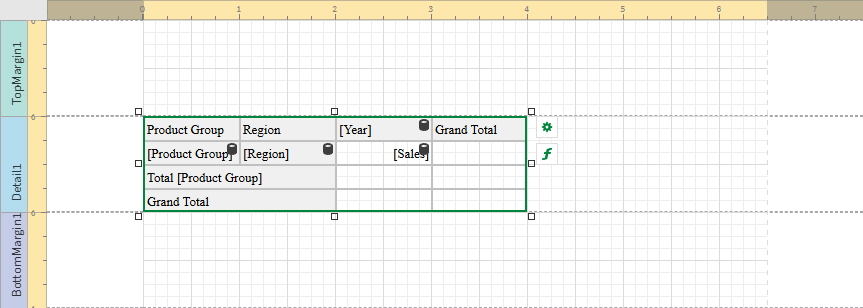
Blank Cross Tab added to template. The image also shows the data source that will be used to bind to the Cross Tab.

Part 2: Connect the Cross Tab to data binding
Do the following:
-
Open the
Properties menu from the right side of the designer.
-
Under Cross Tab Tasks > Data Member in the menu, select the Sales Details 2021-2023 table.
-
Expand Data.
-
Expand Row Fields, and click the plus icon.
-
Expand the new Column Field you created.
-
For Field Name, select the Product Group field.
-
Click the plus icon next to Row Fields a second time, and then expand the new Row Field.
-
For Field Name, select the Region field.
-
Expand Column Fields, and click the plus icon.
-
Expand the new Column Field you created.
-
For Field Name, select the Year field.
-
Expand Data Fields, and click the plus icon.
-
Expand the new Data Field you created.
-
For Field Name, select the Sales field.
Cross Tab after it has been connected to a data binding

Part 3: Refine the presentation
The data structure has been defined. Now we want to fine-tune its appearance.
We want to configure the format of numbers to reflect that they represent currency. Select the cell showing [Sales], and click the gear icon that appears next to it.
Under Text Format String, enter the following:
{0:$ #,#0.00}Repeat this process for the other five cells that will contain sales values when the report is generated.
Next, you can adjust properties at the Cross Tab level, and for each cell in the Cross Tab.
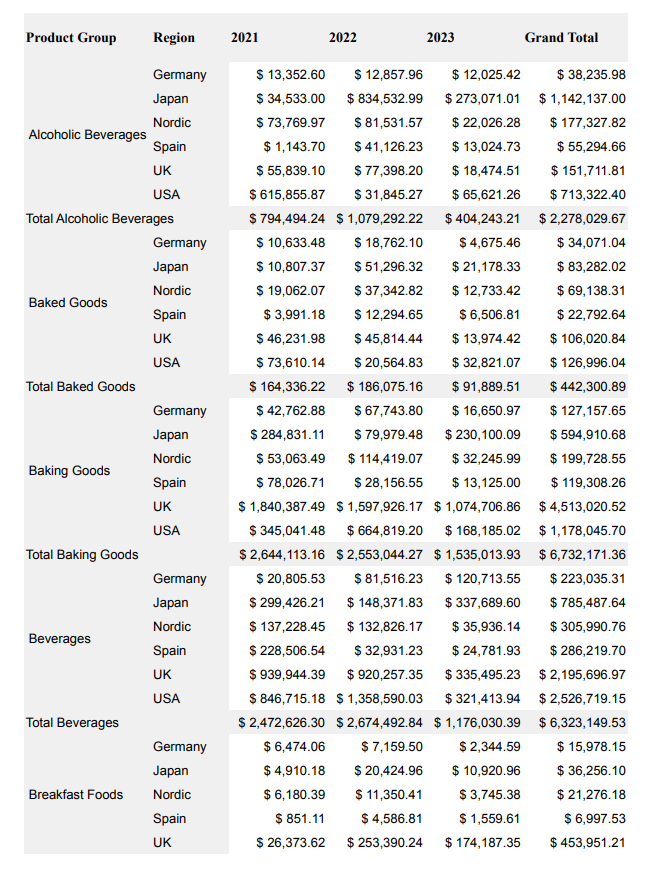
Here are some examples of properties that were modified to produce the report below:
-
Column Auto Width Mode
-
Row Auto Height Mode
-
Border
-
Background Color
-
Font
-
Padding
-
Text Alignment
As you work, you can change the height and width of each cell in the Cross Tab.
Run previews to check the effects of your changes.
Report preview for Cross Tab example

