Aggregating data using charts
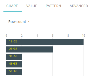
The Chart tab shows a graphical representation of your data. It can also be used as way of aggregating data and previewing some interesting statistics.
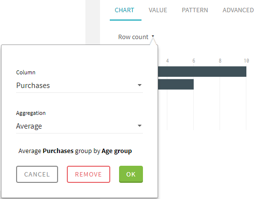
The data aggregation in Talend Data Preparation allows you to easily gather the information of two columns to perform statistical analysis. You can select a first column and compare it with the sum, max, min or average of the second column containing numerical values. The chart will then display more advanced statistics than the ones that are displayed by default.
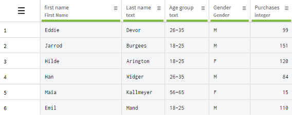
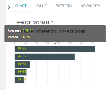
In this example, you work for an online retail company and the dataset you are working on contains information about your customers, such as their age, gender, and number of purchases. You will use the chart tab to quickly preview the average number of purchases depending on the age group of your customers.

Procedure
Results

You have quickly gained some insight on your data with these statistics, and you could perform other aggregation operations, like comparing the total purchases depending on the gender of your customers for example, or any other data category of your dataset.
To remove the aggregation information from the charts, click .


