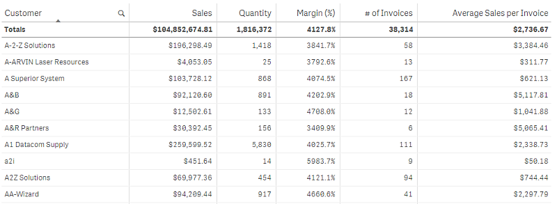
The table shows several fields simultaneously, where the content of each row is logically connected. Typically, a table consists of one dimension and several measures.

You only make selections in the dimension columns. All dimension columns have a search icon in the header.
When to use it
Use a table, when you want to view detailed data and precise values rather than visualizations of values. Tables are good when you want to compare individual values. Drill-down group dimensions are very efficient in tables. Within a limited space, you can drill down to the next level of detail and analyze the updated measure values.
Advantages
You can filter and sort the table in different ways. Many values can be included in a table, and when you drill down in a table, you make good use of the limited space on a sheet. A table is excellent when you want to see exact values rather than trends or patterns.
Disadvantages
If the table contains many values, it is difficult to get an overview of how values are related. It is also hard to identify an irregularity within the table.
Creating a table
You can create a new table on the sheet you are editing.
Do the following:
- From the assets panel, drag an empty table to the sheet.
- Click Add dimension and select a dimension or a field.
- Click Add measure and select a measure or create a measure from a field.
When you have created the table, you may want to adjust its appearance and other settings in the properties panel. For information about styling, see Styling the table. For information about customizing other aspects of the chart's appearance, refer to the current topic and Changing the appearance of a visualization.
Styling the table
You have a number of styling options available under Appearance in the properties panel.
Click Styling under Appearance > Presentation to further customize the styling of the chart. The styling panel contains various sections under the General and Chart tabs.
You can reset your styles by clicking next to each section. Clicking
Reset all resets styles in both General and Chart.
For general information about styling an individual visualization, see Applying custom styling to a visualization.
Customizing the text
You can set the text for the title, subtitle, and footnote under Appearance > General. To hide these elements, turn off Show titles.
The visibility of the different labels on the chart depends on chart-specific settings and label display options. These can be configured in the properties panel.
You can style the text that appears in the chart.
Do the following:
-
In the properties panel, expand the Appearance section.
-
Under Appearance > Presentation, click
Styling.
-
On the General tab, set the font, emphasis style, font size, and color for the following text elements:
-
Title
-
Subtitle
-
Footnote
-
-
On the Chart tab, set the font size and color for the following text elements:
- Header: Style the text of the column headers.
- Content: Style the text of the table content. If you have selected to show a Totals row, it will be styled using these settings, in addition to its text being bold.
Additionally, you can customize how the text appears when a user hovers over a row. See Customizing the hover behavior and scrollbar.
Customizing the background
You can customize the background of the chart. The background can be set by color and image.
Do the following:
-
In the properties panel, expand the Appearance section.
-
Under Appearance > Presentation, click
Styling.
-
On the General tab of the styling panel, you can select a background color (single color or expression), and also set the background to an image from your media library.
When using a background color, use the slider to adjust the opacity of the background.
When using a background image, you can adjust image sizing and position.
Setting the row height
You can adjust the height of the rows in the table.
Do the following:
-
In the properties panel, expand the Appearance section.
-
Under Appearance > Presentation, click
Styling.
-
On the Chart tab, under Row height (in lines), enter a positive integer value representing how many originally sized rows should fit into one newly sized row, height-wise.
Customizing the hover behavior and scrollbar
You can set display options for when a user hovers over a row in the table. You can also set the scrollbar size.
Do the following:
-
In the properties panel, expand the Appearance section.
-
Under Appearance > Presentation, click
Styling.
-
On the Chart tab of the styling panel, under Row hover, adjust the following settings:
-
To highlight rows in the table when a user hovers over them, set the switch to On. Switch the behavior off according to preference.
-
Row hover color: Set the color to highlight the row when a user hovers over it.
-
Row hover font color: Set the color of the text in the highlighted row when a user hovers over it.
-
-
Under Scrollbar size, set the size of the scrollbar in the chart (you can select Small, Medium, or Large).
Customizing the border and shadow
You can customize the border and shadow of the chart.
Do the following:
-
In the properties panel, expand the Appearance section.
-
Under Appearance > Presentation, click
Styling.
-
On the General tab of the styling panel, under Border, adjust the Outline size to increase or decrease the border lines around the chart.
-
Select a color for the border.
-
Adjust the Corner radius to control the roundness of the border.
-
Under Shadow in the General tab, select a shadow size and color. Select None to remove the shadow.
Aligning data
If Text alignment is set to Auto, column data is aligned according to data type: text values are left-aligned and number values, including date related values, are right-aligned. If you set it to Custom, you can align the data to the left, center, or right.
Sorting the table
You can adjust the sorting of the table in several ways:
- Column sorting: adjust the order of the dimensions and measures from left to right
- Row sorting: adjust the sorting priority order of the rows
- Internal sorting: use the internal sorting order of dimensions and measures
- Interactive sorting: during analysis you can click on a column header to sort the table
Column sorting
By default, the order in which columns are sorted is set by the order in which dimensions and measures are added to the table. If you add the measure Sales first, it is presented first (leftmost) in the table. The next dimension or measure that is added is presented in the second column, and so on. The column sorting order can be changed in the properties panel, under Columns.
Row sorting
By default, rows are sorted by the first added dimension or measure, numeric values descending, text values ascending. A small arrow under the column header shows by which column the table is sorted.
You can change the row sorting in the properties panel, under Sorting. Drag the dimensions and measures to change the sorting priority order. In many cases, sorting is not only affected by the first dimension or measure in Sorting, but also the following ones.
Example:
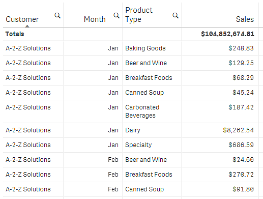
In the following screenshot, the rows are first sorted by Customer, then by Month, and then by Product Type. As you can see, the columns Customer and Month have several rows with the same values (A-2-Z Solutions and Month). The rows in Product Type are ordered alphabetically, but only those that were sold in January to the customer A-2-Z Solutions are displayed.

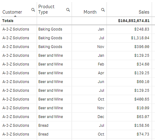
By changing the sorting order, so that secondary sorting is by Product Type, followed by Month, all Product Type items sold to the customer A-2-Z Solutions are presented in alphabetical order, whereas only the months when they were sold are displayed under Month.

Internal sorting
Each dimension and measure has a default (Auto) internal sorting order, which can be changed. Under Sorting, click the item you want to change and click the button to switch to Custom sorting. Changes made to the internal sorting of an item may not have any effect if the sorting is in conflict with an item with higher priority.
Interactive sorting
During analysis, you can set which column to sort on by clicking the column header. The first click sorts the table according to the default sorting of the selected item. A second click reverses the sorting order. Interactive sorting is session based and is not saved. If you want your changes to the sorting to be persistent, you need to make the changes in the properties panel.
Displaying totals
By default, the totals of numeric values are displayed under the column names. In the properties panel, you can change this to display the totals at the bottom of a column, or not at all.
Displaying more data
The chart can be configured to display more data, or to show it in different ways. Under Appearance > Presentation in the properties panel, you can:
-
Freeze the first column from scrolling.
For app consumers who have Touch screen mode activated in the navigation menu, you need to turn on Enable on touchscreen to support the freezing of the first column for these consumers.
-
Select to wrap multiline text in headers and cells separately.
-
Turn off horizontal scrolling and turn on the column picker feature. This lets app consumers change table column order.
Adding a trend indicator to a measure
You can add a trend indicator to a measure column. This will show a symbol next to the measure value. You can define the ranges that determine which symbol is displayed and in which color it is displayed. You enable the indicator by setting Representation to Indicator in the measure properties.
Setting the indicator limits
You need to add the limits for the ranges you want to use for showing indicators with Add limit. You can set a limit value in three ways.
- Use the slider.
- Type a value in the text box.
- Set an expression that returns the limit value.
When you have added the limits, you can select the color and the symbol of the indicator for each defined range.
Styling the indicator
You can style the way the indicator is displayed.
- You can show both the indicator and the measure value by selecting Show values.
- You can set the value color to the same as the indicator color with Apply color to value.
- You can display the indicator to the right or to the left of the value with Indicator position.
Example
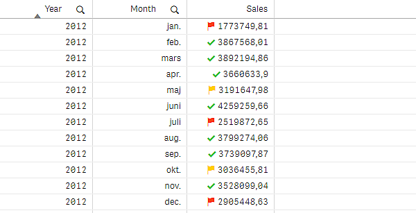
In this example, we added a trend indicator to the Sales measure to indicate which values are below the target value. The indicator limits are:
- For values below 3000000 a red flag is displayed.
- For values in the range of 3000000 to 3500000 a yellow flag is displayed.
- For values above 3500000 a green check-mark is displayed.

Adding a mini chart to a measure
You can add a mini chart to a measure column. This will show a small chart visualization instead of the measure value. You can define the dimension that determines what data is displayed and in which color it is displayed. You enable the indicator by setting Representation to Mini chart in the measure properties.

Setting the mini chart type
After specifying which dimension the mini chart will be based on, you must select a Mode.
- Bars creates a bar chart.
- Dots creates a dot chart.
- Sparkline creates a sparkline chart. You can show dots at each data point along the sparkline chart by selecting Show dots.
- Positive/negative creates a chart with each value represented by a dot above or below the zero.
When you have selected the mode, you can specify the Y-axis of the Mini chart at the bottom of the mini chart options.
Styling the mini chart
You can set the color of bars or lines for Bars, Dots, and Sparkline.
- You can optionally set the Max value color and Min value color, which will highlight the highest and lowest visible chart values.
- You can optionally set the Highlight first and Highlight last colors, which will highlight the first and last visible chart values.
You can set the positive and negative color for a Positive/negative mini chart.
Display limitations
Number of rows and columns
In a table, you can have millions of rows and virtually any number of columns with dimensions and measures. But because huge tables are impractical and hard to manage, the limit for what is practical is far less than the theoretical maximum. In most cases, it is desirable to see all the columns without scrolling horizontally.
Tables with content of mixed sizes
In a table you can have both columns where the content fits on one row within the cell, and columns containing wrapped multiline text. In some cases you will see a shift in alignment and number of rows when the multiline column is scrolled in and out of view. When the view only contains content that fits on one row, the table will adjust and show all content on single line rows, which means more rows are displayed.
We recommend that you disable multiline text wrapping in these cases to avoid confusion for the user.
