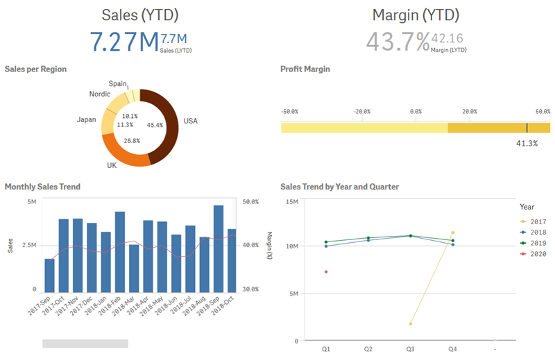
Visualizations let you present data so that your apps users can interpret and explore it. For example, a bar chart that compares sales numbers for different regions, or a table with precise values for the same data. Good visualizations help you quickly and accurately interpret displayed data.
Visualizations are easy to add and customize. They can take the form of charts, such as bar charts, pie charts, tables, gauges, or treemaps. Each chart type has unique functionality. In the Qlik Sense Dev Hub, you can create custom objects. Qlik Sense automatically highlights items associated with your selections so you can drill-down and filter.

Understand the data sources of your visualizations
You need to understand your data in order to design an effective visualization with a clear purpose. Ask yourself the following:
- What kind of data is it? Nominal, ordinal, interval, or ratio data?
- How do different parts of the data relate to each other?
- Can you organize the data in a way that makes it easy for you to create your visualizations?
- What do you want to communicate with your data?
- Are there dimensions or measures you will want to reuse in multiple visualizations?
You also need to understand your data in terms of fields, dimensions and measures. These affect how your data is used in your visualizations.
For more information, see Best practices for data modeling.
Select visualization types that align with your purpose
Each visualization type has a specific goal. You need to think about the purpose of your visualization, and pick a visualization type that lets you explore your data for that purpose effectively.
For example: You want to show how a measure, quarterly sales, behaves over time. You should create a line chart, because one of its strengths is displaying how measure values change over time. Alternatively, you can start with the type of analysis you want to make.
For more information, see Best practices for choosing visualization types and Creating and editing visualizations.
If you are unsure of what visualization types to use with your data, Qlik Sense offers two methods of creating visualizations with assistance:
-
You can use Insight Advisor to let Qlik Sense analyze your data and generate visualizations based on your searches or selections. You can then choose to add these visualizations to your sheets.
For more information, see Creating visualizations with Insight Advisor.
-
You can also create visualizations using chart suggestions by dragging a field onto the sheet from the assets panel and then dragging additional fields that you want in the visualization onto the first field. Qlik Sense then creates a suggested visualization based on the fields selected for the visualization.
For more information, see Creating visualizations using Insight Advisor chart suggestions.
