Dimensions determine how the data in a visualization is grouped. For example: total sales per country or number of products per supplier. You typically find a dimension as the slices in a pie chart or on the x-axis of a bar chart with vertical bars.
Dimensions are created from fields in the data model tables.
Example:
Product Type is a field in the Product table that is loaded into the app. The values of this field are the different types that products are grouped into.
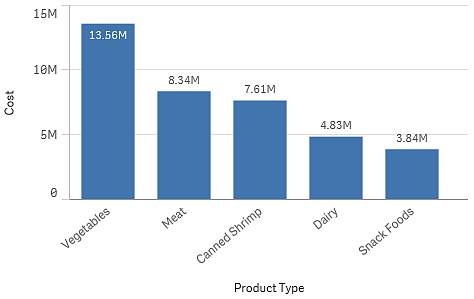
You can, for example, create a bar chart to visualize the cost of each type, by adding the Product Type dimension to the chart. To complete the visualization, you must add a measure (in this case Cost), which is grouped by the Product Type dimension.
Bar chart with the dimension Product Type and measure Cost.

You can also create different types of master dimensions:
Learn more
- Fields
- Measures
- Reusing dimensions with master dimensions
- Creating a master dimension from the data model viewer
- Deleting a master dimension or master measure
- What is a dimension?
- Understanding dimensions and measures
