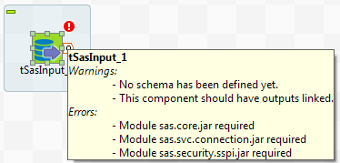
Warnings and error icons on components
When a component is not correctly defined or if the link to the next component does not exist yet, a red checked circle or a warning sign is docked at the component icon.
Mouse over the component, to display the tooltip messages or warnings along with the label. This context-sensitive help informs you about any missing data or component status.