Editing visualizations created by Insight Advisor
Insight Advisor selects and generates charts driven by analysis types. Analysis types and chart functions are chosen based on the inputs of the search and characteristics of the data. Business analysts design the business logic components of apps and can also edit properties and extend the functions underlying the charts further. For more information, see Business logic. For more information on analysis types, see Insight Advisor analysis types.
The following examples show ways that Insight Advisor charts can be edited through properties and the expression editor to enhance visualizations that best capture and frame your data. These examples are based on charts that can be generated and then extended from the Insight Advisor business logic tutorial app. For more information, see Tutorial – Customizing how Insight Advisor interprets data.
Screenshots in the examples may differ depending on the date on which you loaded the business logic tutorial app.
Mutual Information: Changing measures for improved charts
Statistical dependencies between a specified value (measure) and other selected items is presented in Insight Advisor by the Mutual Information chart. The dependency ranges between 0% (no dependency) and 100% (strong dependency). This example shows how you can replace measures to present more interesting and meaningful relationships in the chart. For more information, see MutualInfo - chart function.
Do the following:
-
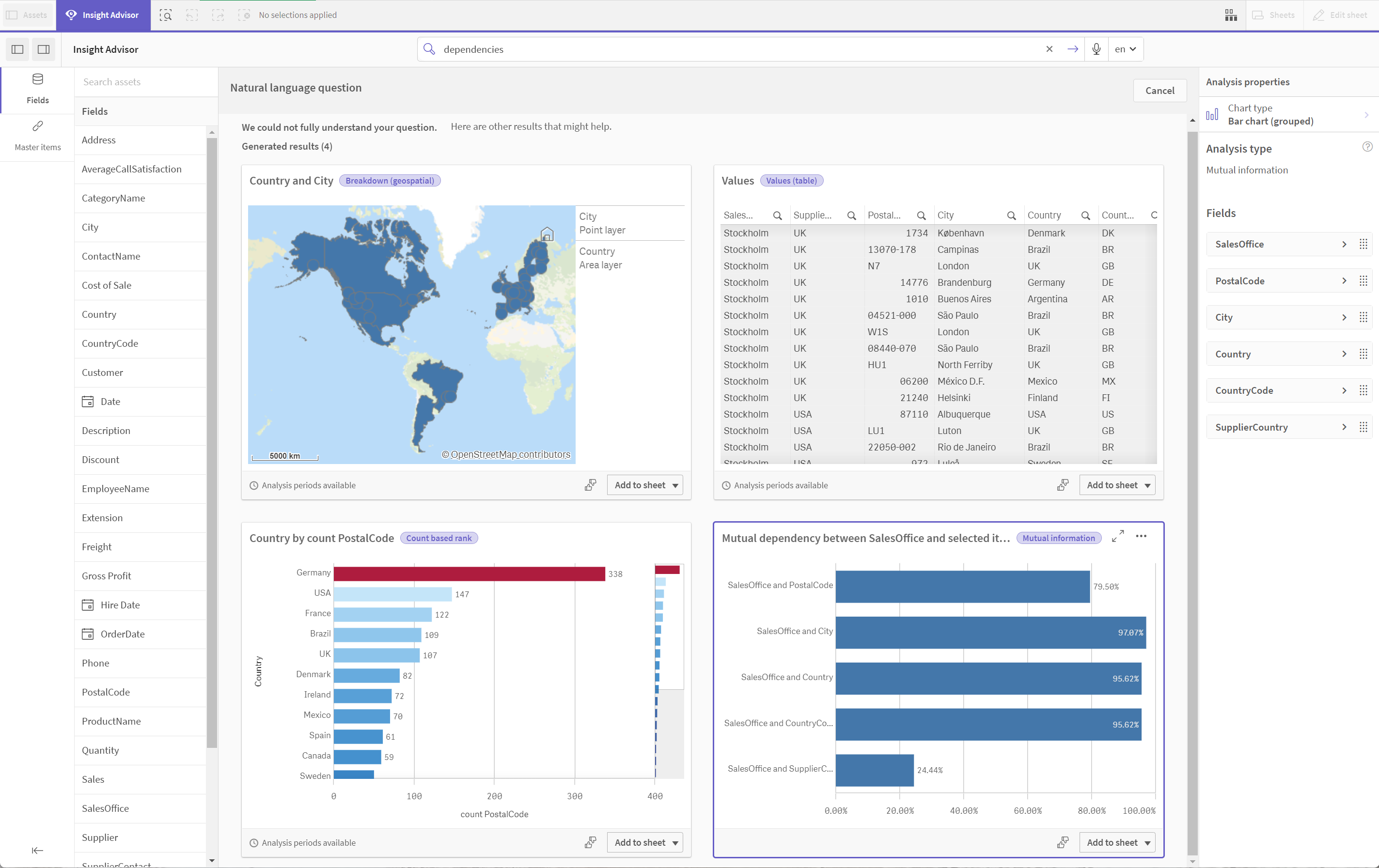
In the business logic tutorial app, enter the search dependencies in the search box. Look for a result displaying Mutual dependency between SalesOffice and selected items.
-
Select Add to sheet in the chart, then
Create new sheet.
-
From the app overview, click
Sheets to view the sheets. Select My new sheet and give the sheet a Title and Description. For this example, name the sheet Mutual Information Sales and an optional description Mutual information between sales fields.
-
Click
Edit sheet in the toolbar and select the mutual dependencies chart.
-
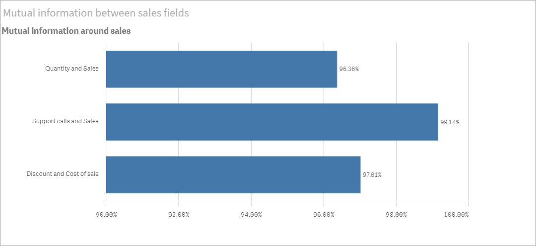
Click anywhere in the chart title to change the title from Mutual dependency between SalesOffice and selected items to Mutual information around sales.
- Modify the fields analyzed in this chart. Insight Advisor selected four measures to include in the chart that are related to geography. This was a reasonable interpretation of what dependencies the field SalesOffice might have because SalesOffice was classified as a city in the logical model of the app. Modify the measures in the properties panel and change them to fields that will better reflect how Sales is impacted by variables related to sales quantity, cost of sales, and sales support.
-
Select Data in the properties panel and in the Measures section; expand the measure SupplierCountry.
Select
in the Expression field to open the Edit expression dialog. Click Apply.
Edit the expression by replacing SalesOffice with Quantity and replace SupplierCountry with Discount.
Select the Label field. Replace SupplierCountry with Quantity and Sales. -
Expand the measure SalesOffice and PostalCode.
Select
in the Expression field to open the Edit expression dialog.
Edit the expression by replacing SalesOffice with Sales and replace PostalCode with SupportCalls.
Select the Label field . Replace PostalCode with Support calls and Sales. -
Expand the measure SalesOffice and City.
Select
in the Expression field to open the Edit expression dialog.
Edit the expression by replacing SalesOffice with Discount, and replace City with Cost of Sale.
Select the Label field. Replace City with Discount and Cost of sale. - Delete the measure SalesOffice and Country by right-clicking on the measure and choosing Delete.
- Delete the measure SalesOffice and CountryCode by right-clicking on the measure and choosing Delete.
- Edit the X-axis range. These three measure comparisons all represent high levels of dependency. To emphasize the differences in values and make the chart more interesting, modify the range of the bar chart:
- Expand the Appearance section and then X-axis.
- Switch Range from Auto to Custom.
- Select Min/Max for values to set. Set Min to 0.9 and Max to 1.
- Select
Done editing.
Default results for Mutual Information search

K-Means clustering: Editing the number of clusters and selections
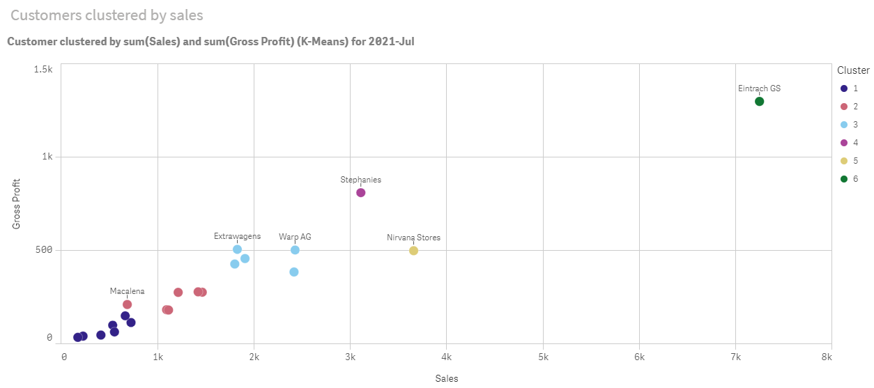
Insight Advisor generates a scatter plot chart driven by k-means functions to group similar items into clusters. The following example shows how you can specify the number of clusters generated by the chart and remove outlying datapoints. For more information, see KMeans2D - chart function and KMeansND - chart function.
Do the following:
-
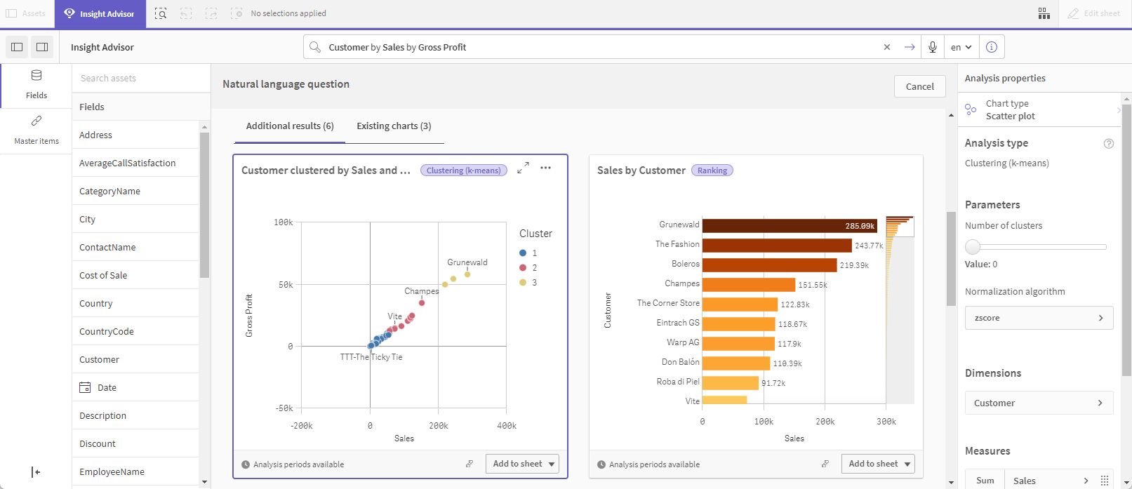
In the business logic tutorial app, enter the search Customer by Sales by Gross Profit in the search box. Look for the result titled Customer clustered by sum(Sales) and sum(Gross Profit) (K-Means).
-
Select Add to sheet in the lower right of this chart, then
Create new sheet.
-
From the app overview, click
Sheets to view the sheets. Select My new sheet and give the sheet a Title and Description.For this example, name the sheet Customers clustered by sales and add the description Kmeans applied to customer data by Sales and Gross Profit.
-
Select
Edit sheet in the toolbar and select the k-means cluster chart.
- Modify the scatter plot chart:
- Enlarge chart: Make the chart larger to take up the canvas by dragging the lower right corner.
- Edit the number of clusters argument. Expand the Appearance section and then Colors and legend. Insight Advisor has colored the clusters by dimension. Select
under the Select dimension field to open the expression editor. Modify the num_clusters argument by changing the value 0 to 6 (Insight Advisor utilized auto-clustering where if 0 is entered for the number of clusters, an optimal number of clusters for that dataset is automatically determined). Select Apply.
- Edit axis ranges: The default chart that is generated shows range that is less than 0. Negative numbers are not meaningful in this context and this range takes up space in the chart. In the Appearance section, expand X-axis: Sales and change Range from Auto to Custom. Note that Min automatically resets to 0. Expand Y-axis: Gross Profit and change Range from Auto to Custom and note that Min automatically resets to 0 for the Y-axis as well.
-
Select
Edit sheet to finish editing.
-
Deselect data: Data can be excluded from the chart by deselecting items that are not of interest. Exit edit mode by selecting
Done editing and open the Selections tool
. Search for Customer and select all customers except the following customers: Big Foot Shoes, Boleros, Bond Ltd, El Carnevale, Fritid AB, Las Corbatas, The Fashion, and Vite.
Default results for kmeans search
Edit the first parameter in the expression (num_clusters)

KMeans scatter plot chart after edits
Period over period analysis: Changing the analysis period
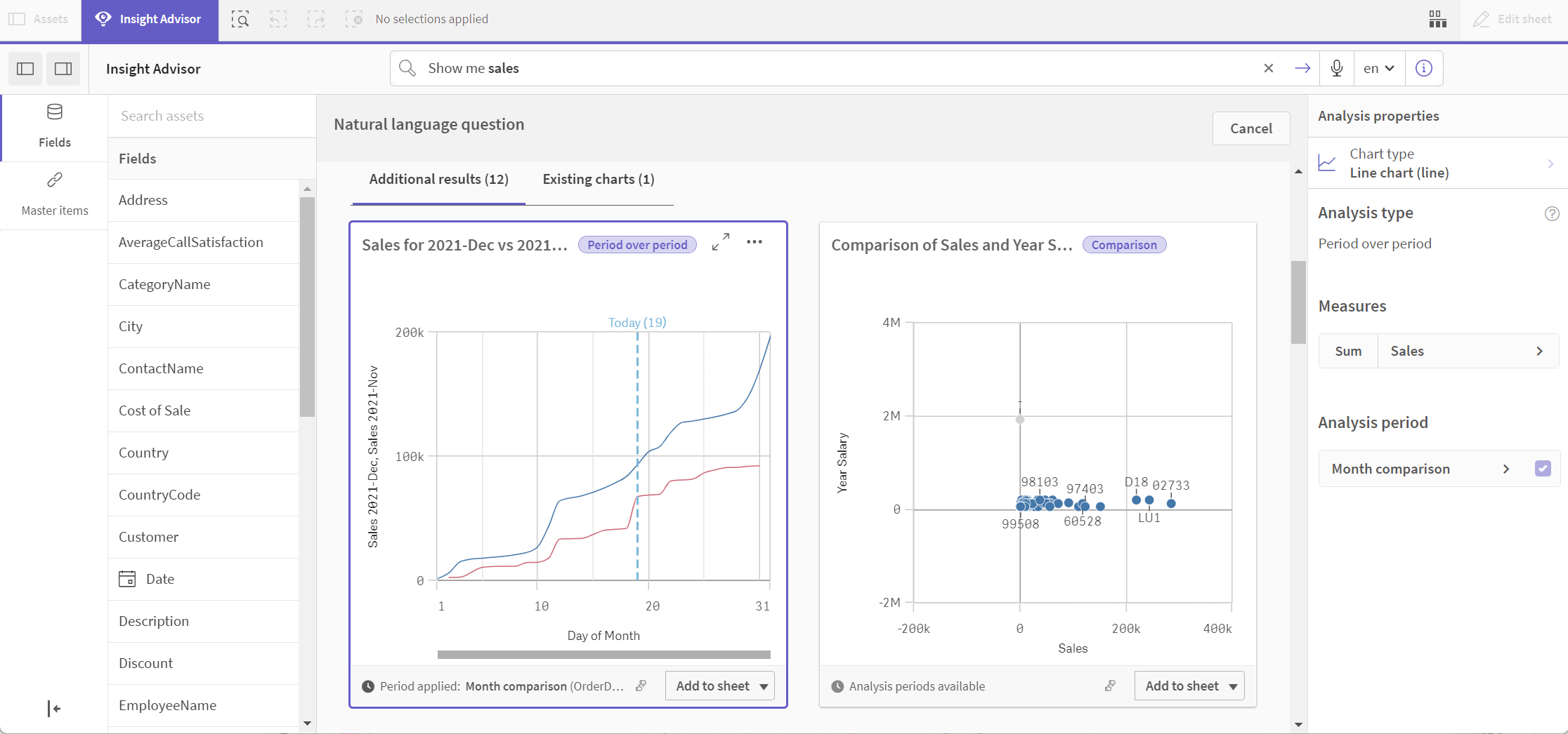
Insight Advisor supports creation of behaviors to use a preferred default calendar period with a measure group. The following example demonstrates how to change the calendar period to view results for a different period. You can change the calendar period property to generate a Period over period chart that displays sales over the last year rather than over the last month.
Do the following:
-
From the business logic tutorial app, enter the search Show me sales in the search box. Locate the Period over period result.
- Select the Period over period chart to display options to the right.
- Expand Analysis period in the properties panel to display calendar period options.
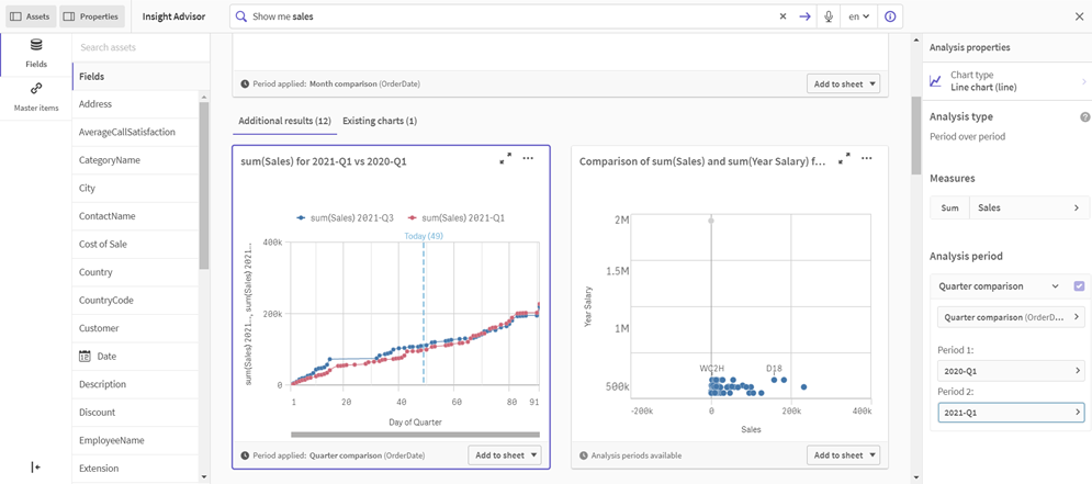
- Select Quarter comparison.
- Change the value in Period 1 to 2020-Q1.
- Change the value in Period 2 to 2021-Q1.
- Sales now displays the results for the first quarter of 2021 compared to the first quarter of 2020.
Period over period result for sales search
Period analysis chart after changing the Analysis period
Spike anomaly detection: Editing the chart style
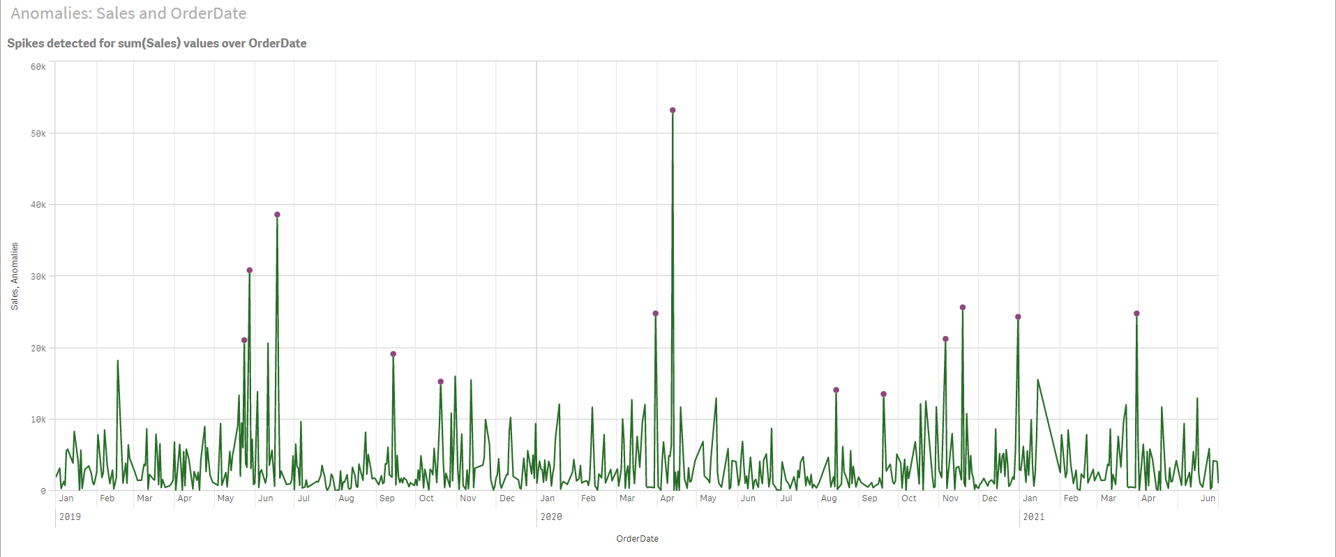
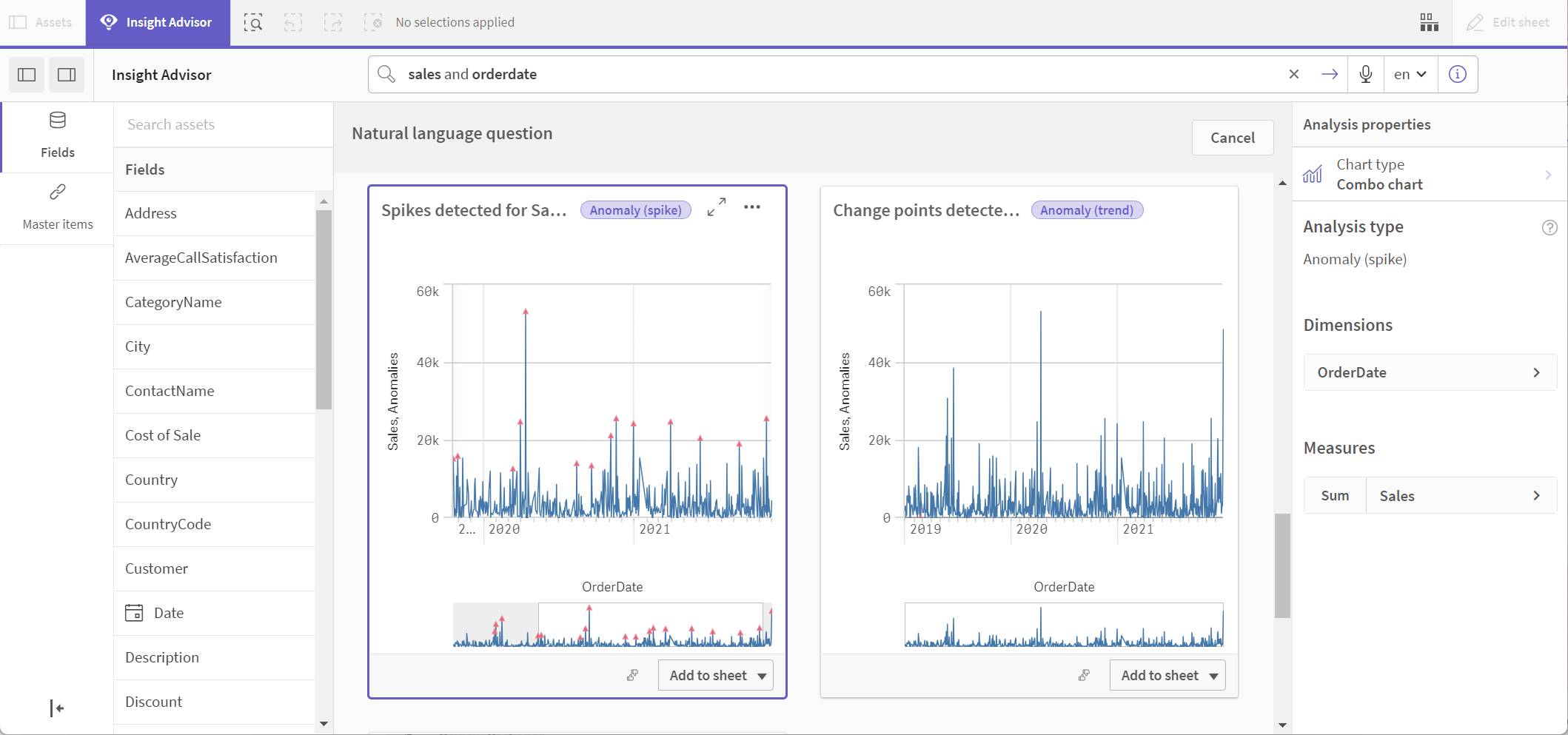
Insight Advisor identifies Spike anomalies by analyzing patterns in the historical data. This analysis type detects and marks anomalies that fall outside of those patterns. This example demonstrates how to modify the default styling of a chart generated by the Spike analysis type.
Do the following:
-
In the business logic tutorial app, enter sales and OrderDate in the search box. Look for the result titled Spikes detected for sum(Sales) values over OrderDate.
Spike analysis result for Sales and OrderDate
-
Select Add to sheet>
Create new sheet.
-
From the app overview, click
Sheets to view the sheets.
-
Select My new sheet and give the sheet a Title and Description.
For this example, name the sheet Anomalies: Sales and OrderDate and add the description Sales spikes detected across order dates.
-
Select
Edit sheet in the toolbar and select the chart.
- Modify the chart:
- Enlarge chart: Make the chart larger to take up the canvas by dragging the lower right corner.
- Modify the spike point style:
Select Data > Measures > Height of marker > More properties.
Expand Presentation and select Line. This changes the spike point to a medium sized circle. Alternatively, select Marker and then select Circle, Square, Diamond, Triangle, or Line.
Expand Color and switch the Colors slider from Auto to Custom.
Choose Single color from the dropdown. From the color options, select the second row, second (purple (hex color code #8e477d) option. - Select Appearance > X-axis:OrderDate and clear Show mini chart.
- Modify the line thickness:
Select Presentation > Styling to expand the options: Bar and Line.
Expand Line and move the Line thickness slider to 3. - Modify the line color:
Select Colors and legend.
Switch the Colors slider from Auto to Custom.
Choose Single color from the dropdown. From the color options, select the top-middle (dark green hex color code #267e27) option. -
Select Done editing.
Spike analysis chart after editing
